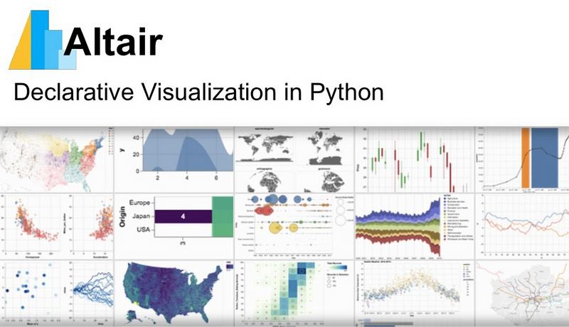
Exploratory Data Visualisation with Altair
In the previous article of Data Visualization , we used Tableau to create a dashboard from places in France. Tableau is a great tool, but it has two primary limitations: 1) while Tableau is quite powerful—and we’ve only scratched the surface of what it can do—sometimes you need to do more. 2) A lot of statistical data work is done programmatically rather than through a drag-n-drop interface.
This week, we will continue to work with the Places-in-France dataset. This time, we will use Altair, a Python library for creating statistical visualizations.
The goals of this lab are:
- Get a better understanding of grammar of statistical visualisations: spaces, mappings, marks, and encodings,
- Give you a sense of a complementary, programmatic way of creating an interactive visualisation,
- Understand the declarative way of thinking used by Altair, Vega-Lite, and D3.
With that in mind, let’s get started.
1- What is Altair ?
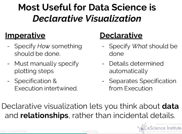
Altair is a package designed for exploratory visualization in Python that features a declarative API, allowing data scientists to focus more on the data than the incidental details. Altair is based on the Vega and Vega-Litevisualization grammars, and thus automatically incorporates best practices drawn from recent research in effective data visualization.
Installation
To be able to use Altair we are required to install two sets of tools depending upon the front end we would like to use.
- The core Altair Package and its dependencies
- The renderer for the frontend we wish to use (i.e., Jupyter Notebook, JupyterLab, Colab, or nteract).
- Additionally, Altair’s documentation makes use of the vega_datasetspackage, and so it is included in the installation instructions below.
Since I will be using Jupyter Lab(recommended), the instructions pertain to it. However, for others, visit the installation page.
conda install -c conda-forge altair vega_datasets jupyterlab
2- Loading data
Download our Places-in-France dataset and place it in the same folder as this notebook.
We’ll now need to import it into our project. Altair can manage multiple data formats. In our case, we’ll use a version of last week’s data converted into CSV format. (It can also handle TSV, JSON, and Pandas Dataframes.)
In our case, we’re going to just use the name of our CSV file. You could also use a URL or a full path.
# Import the Altair library
# by convention, we use alt to save typing, but you can just 'import altair' if you wish
import altair as alt
#alt.renderers.enable('notebook')

# Reference to data
france = 'france.csv'
3- Basic chart
Recall that our data set has columns Postal Code, x, y, inseecode, place, population, and density. Let’s make a map that plots the x vs y columns as points.
In the code below, we’ll make a Chart from the france data using point marks. We’ll bind (or encode the chart’s x= axis to the x attribute of our data set (and similarly for y). In both cases, we tell Altair that the data are Quantitative with :Q. (There’s also :N for nominal/categorical data, :O for ordinal, and :T for temporal data.)
map = alt.Chart(france).mark_point().encode(
x='x:Q',
y='y:Q'
)
map .png)
That looks nice, but notice that Altair shows the origin (0, 0) by default. That’s usually what you want, but not in this case. Let’s tell Altair to hide the axes and the origin.
## Hmm, looks nice, but let's change the default scales.
## Need to change from shorthand notation.
map = alt.Chart(france).mark_point().encode(
x=alt.X('x:Q', axis=None),
y=alt.Y('y:Q', axis=None, scale=alt.Scale(zero=False))
)
map .png)
In the previous map, we had used Altair’s shorthand syntax to specify the data bindings. That works for the common case, but here we need more control, so we have to use an explicit object for the x and y dimensions: alt.X(...) and alt.Y(...). We also need to create a Scale to set its zero=False.
This new chart looks much better, but we really can’t see much detail here. Let’s reduce the default mark size to 1. We’re also going to adjust the chart properties to set the width and height to something bigger.
## Much better, but we really can't see much here. Let's make the point sizes smaller and make the canvas bigger
map = alt.Chart(france).mark_point(size=1).encode(
x=alt.X('x:Q', axis=None),
y=alt.Y('y:Q', axis=None, scale=alt.Scale(zero=False))
).properties(
width=800,
height=800
)
map .png)
In Altair, a chart is made up of three primary things:
- Marks — the kinds of shapes to draw
- Encodings — a mapping from data to attributes of the marks
- Properties — meta-data about the chart
Now that we’ve seen each of them, let’s talk a little more about each.
Marks
Marks are the kinds of shapes that we want to draw. Here is a summary of the kinds of marks in Altair, taken from the Altair documentation.
| Mark Name | Method | Description |
|---|---|---|
| area | mark_area() |
A filled area plot. |
| bar | mark_bar() |
A bar plot. |
| circle | mark_circle() |
A scatter plot with filled circles. |
| geoshape | mark_geoshape() |
A geographic shape |
| line | mark_line() |
A line plot. |
| point | mark_point() |
A scatter plot with configurable point shapes. |
| rect | mark_rect() |
A filled rectangle, used for heatmaps |
| rule | mark_rule() |
A vertical or horizontal line spanning the axis. |
| square | mark_square() |
A scatter plot with filled squares. |
| text | mark_text() |
A scatter plot with points represented by text. |
| tick | mark_tick() |
A vertical or horizontal tick mark. |
The basic idea is that each data point will get mapped into one of these types of marks.
Encodings
Encodings determine the binding between the data point and the mark. In our example, we’ve been encoding the x and y data columns to each mark’s x- and y-position. As you can see in the Altair documentation, there are positional encodings, mark property encodings (as we’ll see in the next step), and interaction encodings (as we’ll see later for with tooltips).
Let’s go ahead and bind the size of the places to their population in our data set. In other words, we’re going to encode the population data attribute by the size of each mark.
map = alt.Chart(france).mark_point(size=1).encode(
    x=alt.X('x:Q', axis=None),
    y=alt.Y('y:Q', axis=None, scale=alt.Scale(zero=False)),

    # NEW: bind population to size
    size='population:Q',

    # Or, try this alternate binding that clamps the range to [1, 400] instead of the default, [0, 400].
    # size=alt.Size('population:Q', scale=alt.Scale(range=[1, 400])),

).properties(
    width=800,
    height=800
)

map
.png)
That looks great! We can already start to see some interesting emergent features from our data, such as the effect of rivers, mountains, and other influences.
Notice the alternative solution in the above code. Go ahead and try the other solution. Do you see a difference in the output? What do you think is going on?
So far, we have bindings for x, y, and population. In the code below, go ahead and bind density to each place’s color. Hint: you declare a color encoding with color=.
## How would we adapt this to encode density by color?
## Hint: you declare a color encoding with color=
map = alt.Chart(france).mark_point(size=1).encode(
x=alt.X('x:Q', axis=None),
y=alt.Y('y:Q', axis=None, scale=alt.Scale(zero=False)),
size='population:Q',
color='density:Q'
).properties(
width=800,
height=800
)
map .png)
4- Altair
So far, we’ve just gotten started with Altair. Before we dig a little deeper, let’s take a closer look at the shorthand notation and the classes used in Altair.
By default, Altair tries to use reasonable defaults. If you’re just exploring data, they’re often good enough. That will let you create basic charts just by binding, say, x and/or y to some column in your data table, e.g. x='population:Q', y='density:Q'.
But if we need to override the defaults, we need to use a more complicated syntax. Each of the encodings defines a configurable class. Instead of using a shorthand string, as we did above, we can pass in an instance of that class. That’s what we did in the first step when we switched from using
x='x:Q',
to
x=alt.X('x:Q', axis=None)
How did we know we could control the axis through the axis= keyword? The Altair documentation lists the different encoding classes available. A click on the X class on that page will take you to the documentation that enumerates the different parameters you can override from their default values. Notice that the third attribute down shows:
axis:anyOf(Axis, None)
Thus, we can either pass in an instance of the Altair Axis class or the value None—in which case, the documentation explains, that axis will be removed from the chart.
Compared to other approaches
Some of you may have heard of or even used other libraries for creating statistical visualisations, including matplotlib, ggplot, Seaborn, and others. Each of these libraries has a healthy community behind them and are perfectly reasonable choices to use, and most of them will use similar concepts to what we are seeing here with Altair.
In this class, however, he use Altair for several reasons:
- It has a nice mapping of Bertin’s and Wilkinsin’s concepts for statistical visualisation (that we saw in class earlier today!) baked into their APIs,
- It uses a declarative rather than procedural design approach,
- You can easily export your visualisations to PNG, SVG, or even interactive web pages, and
- It generates Vega-Lite descriptions that are then rendered using D3, which we’ll see later on in the semester.
That second point probably needs a little more explanation. In a procedural syntax, you could imagine saying something like:
for each data point:
    draw circle of size datum.population at datum.x, datum.y
in our declarative approach, we’d say instead:
make a chart for data where:
    position is (datum.x, datum.y) and size is datum.population
At first glance, those might look awfully similar, but the key difference is that, in the first case, we say how to do what we want, whereas in the second case, we simply say what we want.
Altair, D3, and Vega all use this second, declarative approach. It takes some getting used to, but it is part of what makes these libraries compelling.
5- Tooltips
So far, our visualisations are not particularly interactive. Let’s go ahead and change that.
The barest, most minimal interaction we can add is to show a tooltip when we hover over a place. In Altair, we can use the Tooltip encoding.
# Let's add tooltips
map = map.encode(
tooltip=['place:N', 'population:Q', 'density:Q']
)
map .png)
6- Multiple views
It would be nice to see a different representationof the distribution of population and densities in France. Let’s go ahead and add in a “histogram” of population and density….
A histogram is just a bar chart of the different bins of values, so let’s create a chart using bars for the marks. We want to show the population on the x axis and the number of people in that bin on the y axis:
population = alt.Chart(france, width=800, height=100).mark_bar().encode(
x='population:Q',
y='count(population):Q',
)
population .png)
That’s close, but we’re not really binning our data. Let’s go ahead and create slices (or bins) of the data on the x axis. (In French, we’d call these tranches.)
population = alt.Chart(france, width=800, height=100).mark_bar().encode(
x=alt.X('population:Q', bin=True),
y='count(population):Q',
)
population .png)
That’s better, but the default bins are a bit too big. Let’s override the number of bins. Also, let’s show the number of people in each bin instead of the number of places by replacing the count() with the sum().
population = alt.Chart(france, width=800, height=100).mark_bar().encode(
x=alt.X('population:Q', bin=alt.Bin(maxbins=60)),
y='sum(population):Q',
)
population .png)
Density histogram
Let’s plot the density histogram instead of showing the population.
density = alt.Chart(france, width=800, height=100).mark_bar().encode(
    x=alt.X('density:Q', bin=alt.Bin(maxbins=60)),
    y='sum(density):Q',
)

density
.png)
7 - Making a multi-view visualisation (dashboard)
We now have all of the pieces we need to make a multi-view visualisation (what we called a “dashboard” in Tableau).
In Altair, you can combine multiple charts manually using the & and | operators to combine them vertically or horizontally, respectively.
population & density & map .png)
8 - Interactions
Beyond tooltips, we want to be able to select data points, filter out data, and to be able to link views so that, say, a selection in one might filter what is shown in another (or alter its presentation in some other way).
Let’s start with selections. There are three kinds of selections:
- intervals — a range of values
- single - a single value
- multi - multiple values
Intervals let the user “brush” over a range of values to select them. Single selection select a single data point, while multi selections let the use combine single selections (by default with the shift key). For more info, see the Altair selections guide
Here, let’s add a rectangular selection brush to our map.
brush = alt.selection_interval()
map.add_selection(brush)
.png)
Now try it out. Try dragging a box around a part of the map.
Huh, that sort of works. We see a selection appear, but it doesn’t do anything with it. Let’s fix that.
# Let's gray out unselected places
map = alt.Chart(france, width=800, height=800).mark_point(size=1).encode(
x=alt.X('x:Q', axis=None),
y=alt.Y('y:Q', axis=None, scale=alt.Scale(zero=False)),
size='population:Q',
color=alt.condition(brush, 'density:Q', alt.value('lightgrey')),
).add_selection(brush)
map .png)
Well, that seems to work. It’s a little slow (because we have a lot of large views open in this notebook), but moreover, it doesn’t really do much useful.
Let’s go ahead and link our selection to the histogram. Notice that all we need to do to filter the histogram based on the selection is to add a .transform_filter() to the histogram that uses the map’s selection brush. (See the last line of the histogram.)
brush = alt.selection_interval()
map = alt.Chart(france, width=800, height=800).mark_point(size=1).encode(
x=alt.X('x:Q', axis=None),
y=alt.Y('y:Q', axis=None, scale=alt.Scale(zero=False)),
size='population:Q',
color='density:Q',
).add_selection(brush)
population = population = alt.Chart(france, width=800, height=100).mark_bar().encode(
x=alt.X('population:Q', bin=alt.Bin(maxbins=60)),
y='sum(population):Q',
).transform_filter(brush)
population & map .png)
9- HeatMap
Let’s try making a heatmap of places in France by setting color to 'count()' and using mark_rect()
map = alt.Chart(france, width=800, height=800).mark_rect().encode(
x=alt.X('x:Q', axis=None,bin=alt.Bin(maxbins=90)),
y=alt.Y('y:Q', axis=None, scale=alt.Scale(zero=False),bin=alt.Bin(maxbins=90)),
color=alt.Color('count(population):Q')
)
map .png)