Graph Analysis with Networkx
Graph analysis is not a new branch of data science, yet is not the usual “go-to” method data scientists apply today. However there are some crazy things graphs can do. Classic use cases range from fraud detection, to recommendations, or social network analysis. A non-classic use case in NLP deals with topic extraction (graph-of-words).

visualisation of a graph-of-words, where each community represent a different topic
Consider a fraud detection use case
You have a database of clients, and would like to know how they are connected to each other. Especially, you know some clients are involved in complex fraud structure, but visualizing the data at an individual level does not bring out evidence of fraud. The fraudsters look like other usual clients.
Working on connections between users can show a lot more information than you had simply by looking at raw data. Specifically, features that would not be considered risky for a usual machine-learning based scoring model (phone number, email address, home address) can become features of risk in a graph based scoring model.
Example: three individuals with the same phone numbers, connected to other individuals with the same email addresses is unusual and potentially risky. The value of the phone number does not give any information in itself (therefore even the best deep learning model would not capture any value out of it), but the fact that individuals are connected through the same values of phone numbers, or email addresses can be synonym of risk.
Let’s do this in Python.
Setting up the data, cleaning, and creating our graph

This will be our simulated user database
So you start from a pandas DataFrame (which is basically an Excel table in Python)
Alright, data is loaded in df. Now, some preparation. You need to connect individuals (represented by their ID) that have the same phone number and same email. We first start with phone number:
# By joining the data with itself, people will have a connection with themselves.

# Remove self connections, to keep only connected people who are different.

d = data_to_merge[~(data_to_merge[column_ID]==data_to_merge[column_ID+"_2"])] \

.dropna()[[column_ID, column_ID+"_2", column_edge]]

# To avoid counting twice the connections (person 1 connected to person 2 and person 2 connected to person 1)

# we force the first ID to be "lower" then ID_2

d.drop(d.loc[d[column_ID+"_2"]<d[column_ID]].index.tolist(), inplace=True)
Our data now looks like this:

Great, 1 and 3 are connected, and 5 and 6 as well. We do the same with email addresses (full code shared at the end of the article). Now let’s build a graph. I’ll share only the simple part of the code here since it’s a bit tricky to add different link types.
import networkx as nx

G = nx.from_pandas_edgelist(df=d, source=column_ID, target=column_ID+'_2', edge_attr=column_edge)

G.add_nodes_from(nodes_for_adding=df.ID.tolist())
Now let’s visualize our data.
Graph visualization with networkx
The simple nx.draw(G) gives us the following:

Wooo quite interesting pattern! But wait, we can’t see who are the individuals, and what are the links. Let’s customize it:

Nice catch! 4 individuals connected together, by 2 different phone numbers and 1 email address… Some more investigations should follow!
Next steps for a real industrialization
Let’s recap what we’ve done:
- Creation a graph from our user database
- Custom visualization that helps us see strange patterns
If you are business-driven, and expect some experts to use what you’ve done, your next focus should be:
- Automation of the process of finding multiple people connected together, or risky pattern detection
- Automation of the process of creating visualizations and creating custom dashboard with graph visualization and raw data
I will not go into details here, but give you ideas on how to proceed for these 2 steps
1. Risky pattern detection
Two ways to proceed here:
- go from individuals who you consider risky (or who you detected as fraudsters) and check their relationships to other individuals. To relate to Machine Learning, it would be a kind of “supervised” method. To go further, you can also start from a Machine Learning scoring, identify the nodes with the highest score and look for their connections in the graph to catch more nodes
- Identify unusual patterns (too many connections, dense network…). This would be the “unsupervised” method similar to anomaly/outlier detection
In our example we don’t have known fraudsters, so we’ll go for the second method.
Networkx has algorithms already implemented to do exactly that: degree(), centrality(), pagerank(), connected_components()… I let you define how mathematically define the risk.
2. Creating visualizations and automating analyses for the business
It will sound old school for the majority of data scientists, but a quick way to do it would be in Excel.
xlsxwriter package helps you paste data from the graph of risky people, and paste the image of the graph we created straight into the Excel file. You’ll get a dashboard for each risky network like this:
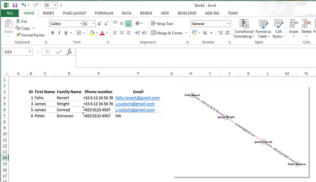
For each potentially risky network, you would automate this creation of dashboard, send it to the experts and let them assess/confirm the risk. You could add some metrics in the dashboard: number of people involved, number of different phone numbers, email addresses, ML scores of each node…
I hope you found this article useful